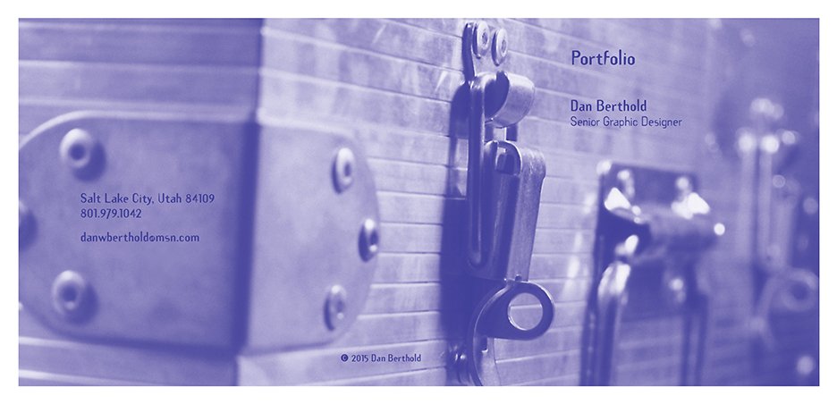
I took this photo of my original portfolio case. I designed the case and had it produced at a local shop. The material is aluminum with high density foam on the interior. The photo has also been used for a Portfolio CD Case Cover as a leave-behind with clients.
Here is a link to my Resume: tinyurl.com/r362dz6a
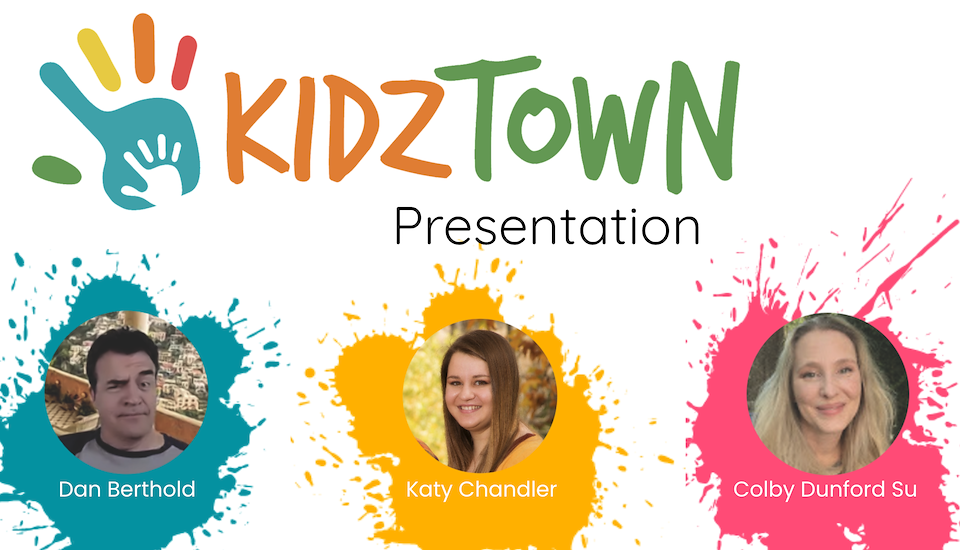
Case Study—Non-Profit Organization:
KidzTown
This is one of several group projects we worked on in the UX/UI Design Bootcamp through the University of Utah.
Here is the link to the Presentation: https://tinyurl.com/kh6zsm49
The link to the XD Prototype: https://tinyurl.com/72w4wc6f

Case Study—Government Agency Redesign:
The U.S. Department of Education
This is one of several group projects we worked on in the UX/UI Design Bootcamp through the University of Utah.
Here is the link to the presentation: https://tinyurl.com/968pbu96
The link to the XD Desktop and Mobile Prototypes:
https://tinyurl.com/cesfw8xu
https://tinyurl.com/bnkh7bfw
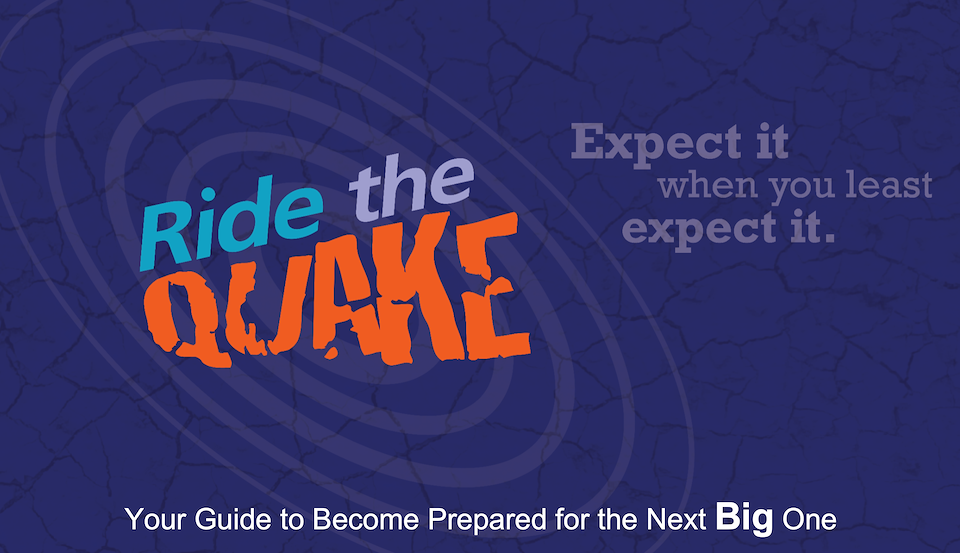
Case Study—Create a New Non-Profit Organization:
Ride the Quake
This is one of several group projects we worked on in the UX/UI Design Bootcamp through the University of Utah.
Here is the link to the Presentation: https://tinyurl.com/wm5y666s
The link to the XD Prototype: https://tinyurl.com/strnyha8
The link to the preliminary website: https://scrunnchy.github.io/rideTheQuake/
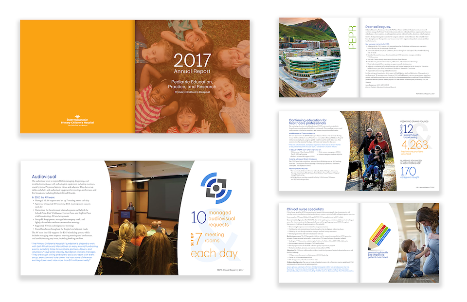
A sample of a 32-page (8"x8") Annual Report designed for the Pediatric Education, Practice and Research team at Primary Children's Hospital.
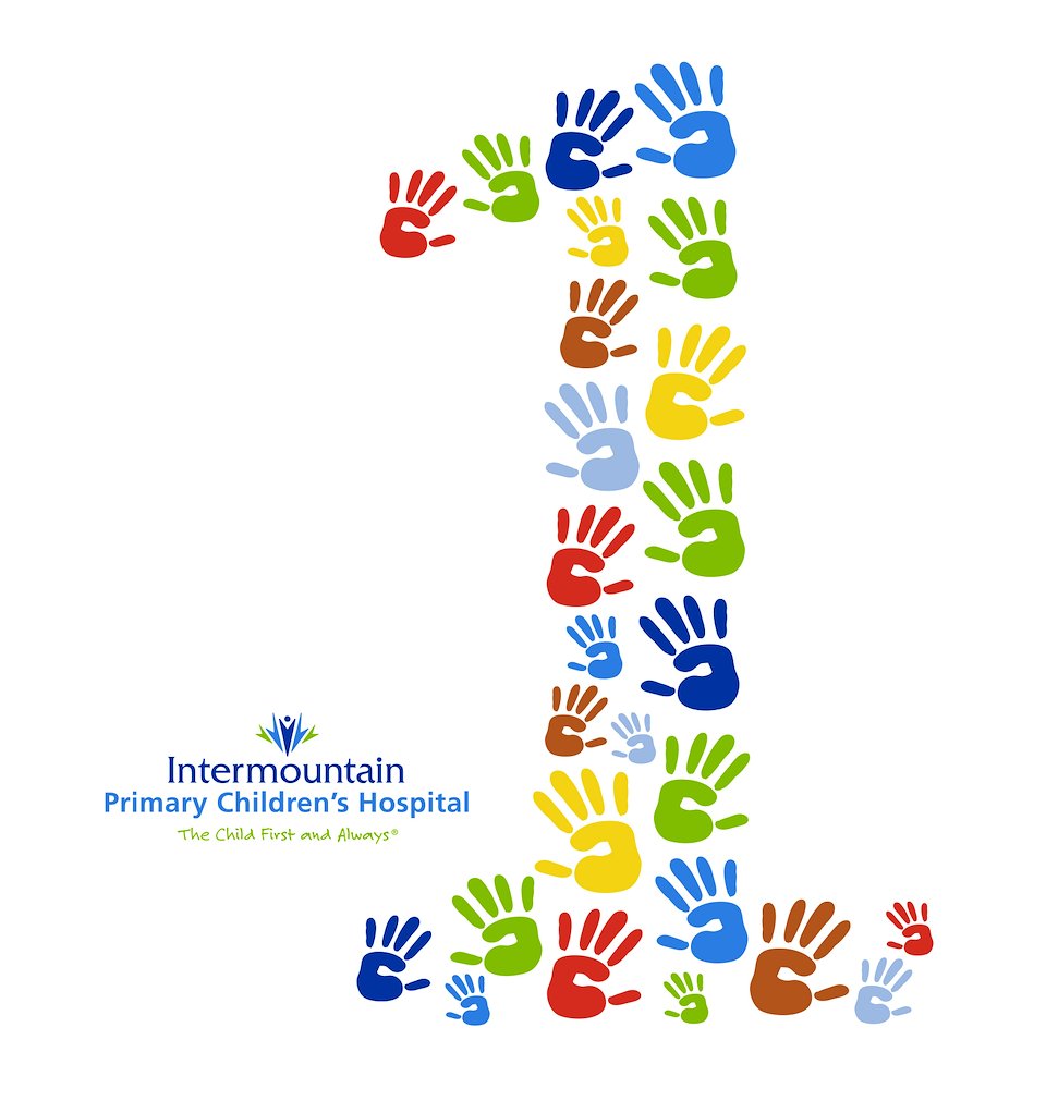
This is the winning logo designed and entered into a competition for the launch of a new Patient Experience recognition program at Primary Children’s Hospital. What inspired this design? “I first thought of the importance of "The Child First and Always.” The number ‘1’ is important to illustrate being first, a No. 1 priority. Primary Children’s is first when it comes to the clinical and non-clinical staff who make it a priority to offer the best care in the country. I thought about the importance of the caregivers who do so much, but there are also parents and family involved as well.
Many patients are treated from different backgrounds and influence. I chose the various hand sizes to illustrate the multiple age ranges of patients and caregivers involved, and the various colors used are the primary and secondary colors used by Primary Children’s Hospital. These colors depict the diversity of the many patients and people involved in the care and treatment of the children. When all these aspects are combined, we’re all working together as 1, with 1 common goal: “The Child First and Always.”
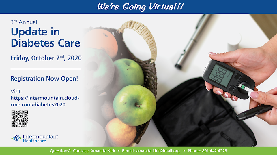
A Screensaver for the Update in Diabetes Care
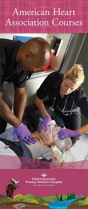
Retractable banner designed for Pediatric Education Services (PES) American Heart Association. Approx: dimension is 3' x 6.5'
/background(fff)/960x1129.jpeg?auto=webp)
This is an alternative invitation for a cancelled conference due to COVI-19.
/background(fff)/960x660.jpeg?auto=webp)
A Save the Date card for one of the longest running conferences (Front)
/background(fff)/960x660.jpeg?auto=webp)
A Save the Date card for one of the longest running conferences (Back)
/background(fff)/960x2097.jpeg?auto=webp)
A Brochure for one of the longest running conferences (Front)
/background(fff)/960x2097.jpeg?auto=webp)
A Brochure for one of the longest running conferences (Back)
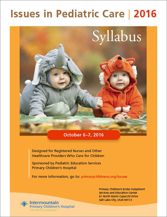
Syllabus Cover for Issues in Pediatric Care Conference.
/background(fff)/960x523.jpeg?auto=webp)
Save the Date card (Front)
/background(fff)/960x523.jpeg?auto=webp)
Save the Date card (Back)
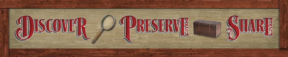
Designed this for the Family Search Center to resemble an antique wooden sign. I fabricated the sign by using foam-core board and various color prints. The over-all dimensions are 70" wide and 14" tall. The following image is the actual sign installed in the designated area.
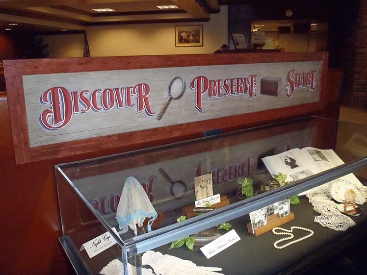
Designed this for the Family Search Center to resemble an antique wooden sign. I fabricated the sign by using foam-core board and various color prints. The over-all dimensions are 70" wide and 14" tall. This image is the actual sign installed in the designated area.
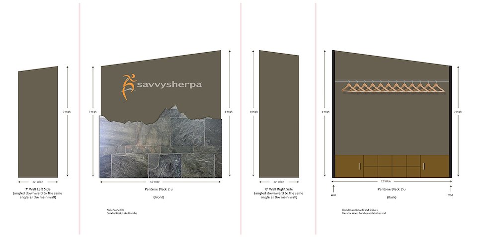
Designed an entry wall for the office in Draper, Utah. The front of the wall contains the logo which is three-dimensional, and carved from wood. The stone facade is slate stone tile, sculpted to reflect one of the mountain ranges along the Wasatch Front. The tile wraps around the 2 short sides. The backside is for coats and storage cupboards as depicted in this mock-up.
Designed a logo for a new data intensive and research focused company that improves client’s data management, efficiency, productivity, and over-all success.
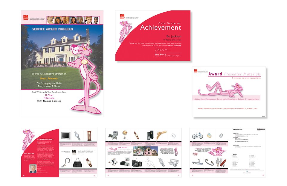
An 8-page Brochure and Certificate
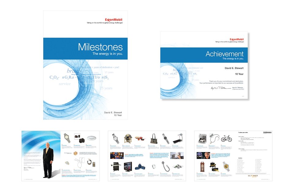
An 8-page Brochure and Certificate
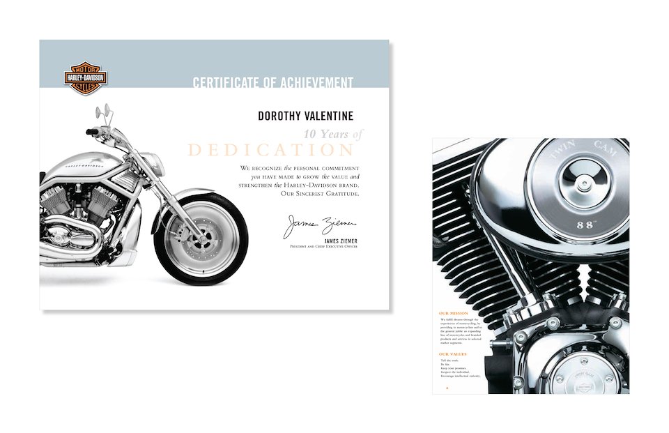
A Certificate for Harley Davidson, and a page design from the Brochure.
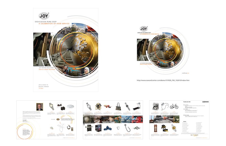
An 8-page Brochure and Certificates
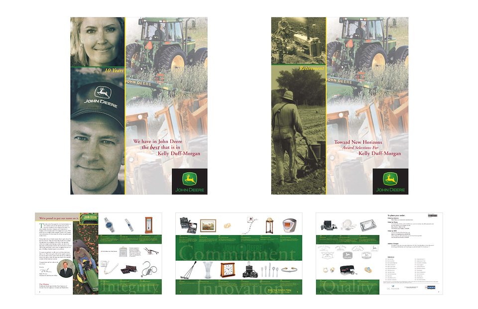
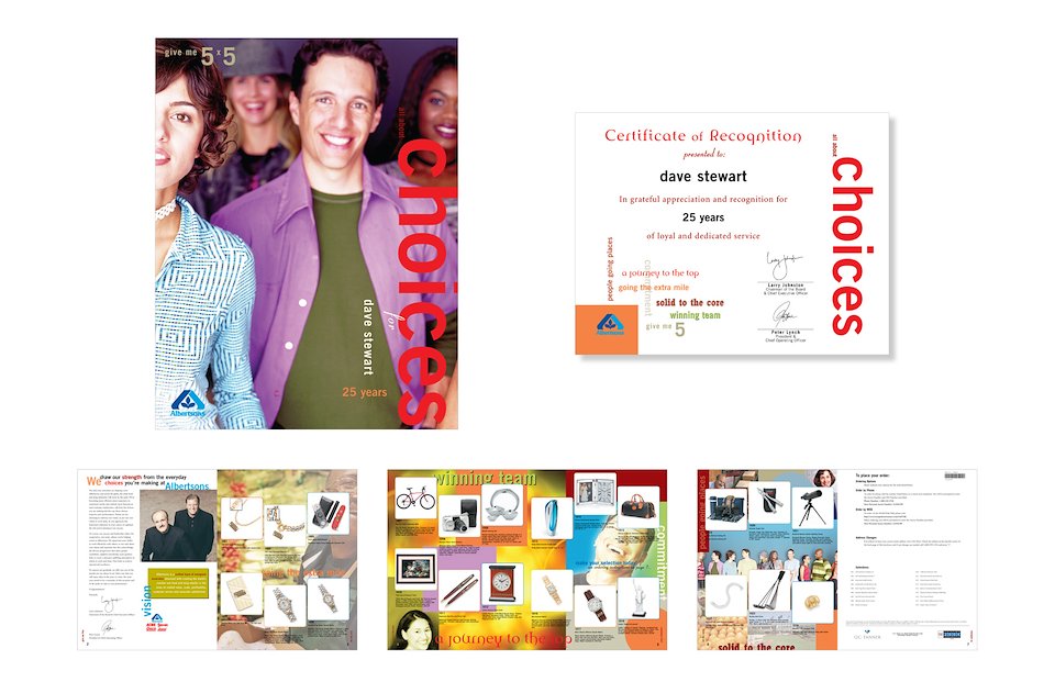
An 8-page Anniversary and Retirement Brochure
An 8-page Brochure and Certificate
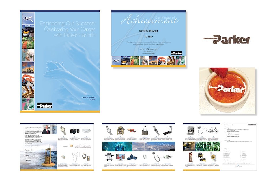
This is one of many brochures I designed. This project involved a unique opportunity to do something more for the client. With a customer visit approaching, I conceptualized, designed, and created a template to be used that would facilitate the customizing of their dessert to reflect the client’s logo. After trying various textures and consistencies of cocoa powder, chocolate shavings, and powdered sugar, the powdered sugar was the most accommodating ingredient to sprinkle on the Tiramisu. This was so successful, that similar methods were used for future client visit’s.
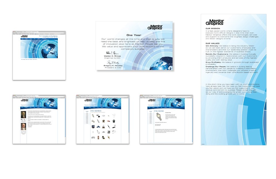
An 8-page Brochure and website page.
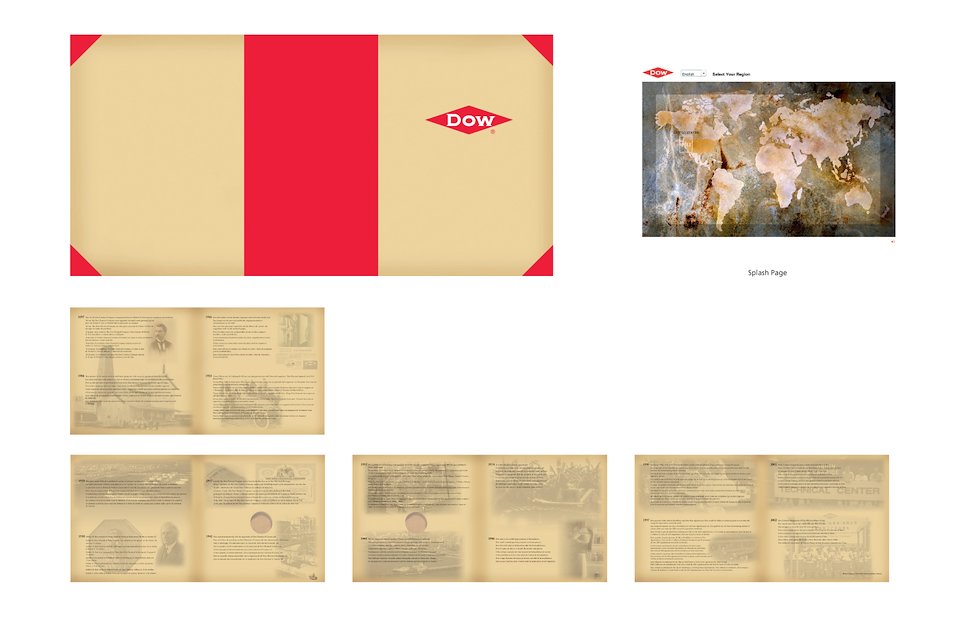
This is a Leather-Bound Retirement Commemorative Coin Book for Dow Chemical that I designed. The book measures 7" x 7", and houses a high-class collectible coin that could be seen on either side. Strict guidelines by the client had to be followed, as well as parameters set forth by the producer in China. I also designed a custom website to coincide with the retirement program.
Signage and Certificate.
Designed a 3-sided Table Tent.
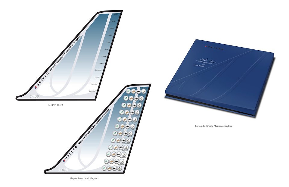
I designed this Magnet Board that measures approximately 20" tall. It is made of aluminum and the graphics were screen-printed onto the surface. I also designed the magnets to be used on the board. The purpose of the magnet board is to be displayed in the break room, with the option of standing it upright on a desk or mounting it on the wall, honoring the goals achieved by the employees each month. I also designed the Certificate of Achievement Box that was used for the Certificate to complete the presentation to the recipient.
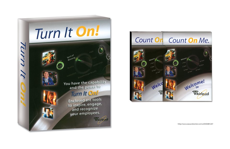
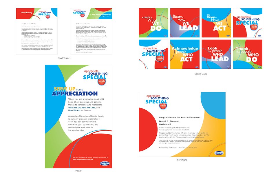
This is a project that I designed the graphics, as well as the various themes for the various programs to be used by the client. These are 2 of the packages I designed.
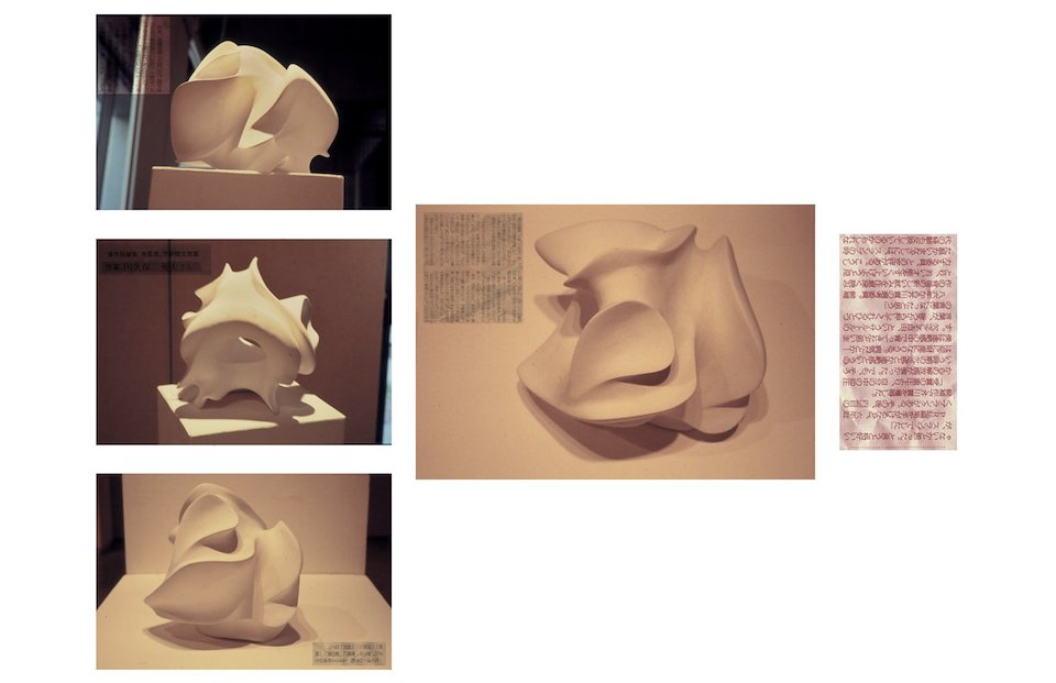
Sculpture is another one of my passions. This was created out of a block of plaster. It became a product of countless hours of work, and a stream of consciousness that dictated every curve and angle.
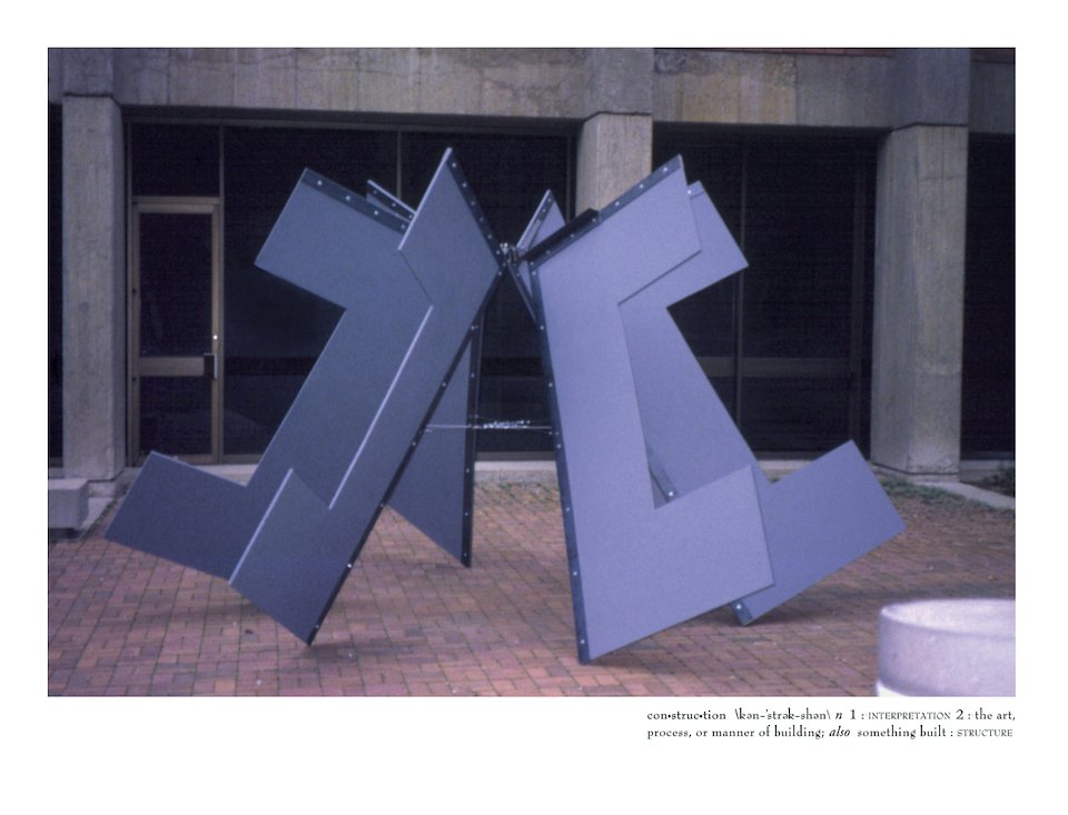
Sculpture of wood and steel. Repeating a single image demonstrating movement and balance (close-up).
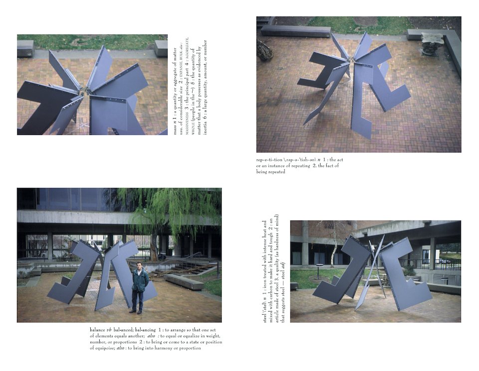
Sculpture of wood and steel. Repeating a single image demonstrating movement and balance (various perspectives).
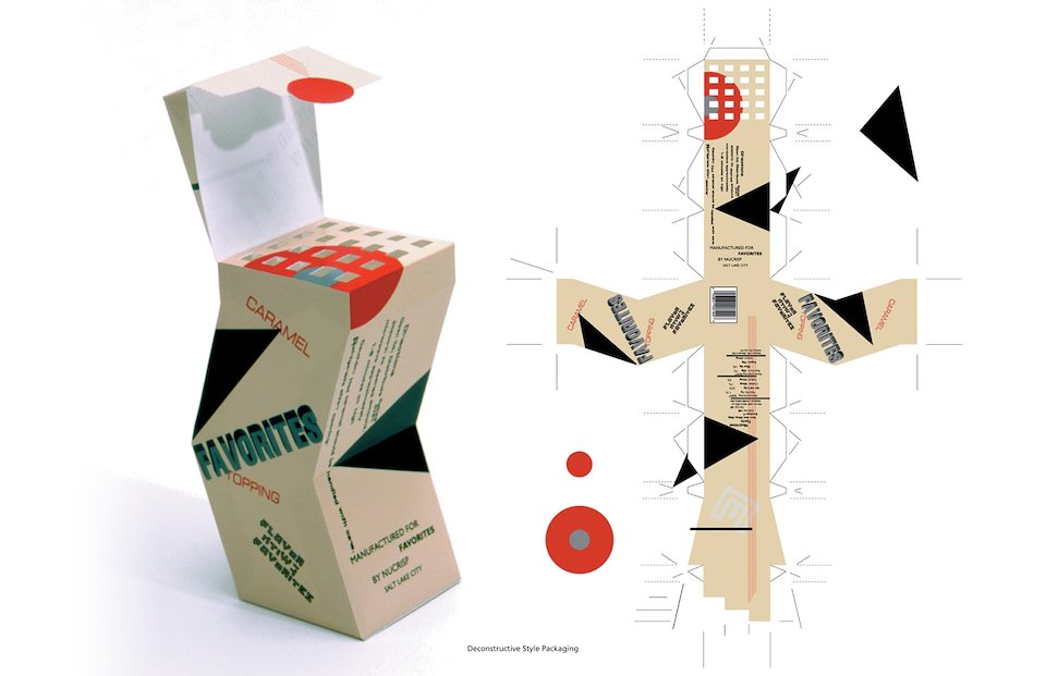
Deconstructive Style Packaging (1 of 4 versions for Favorites Caramel Topping)
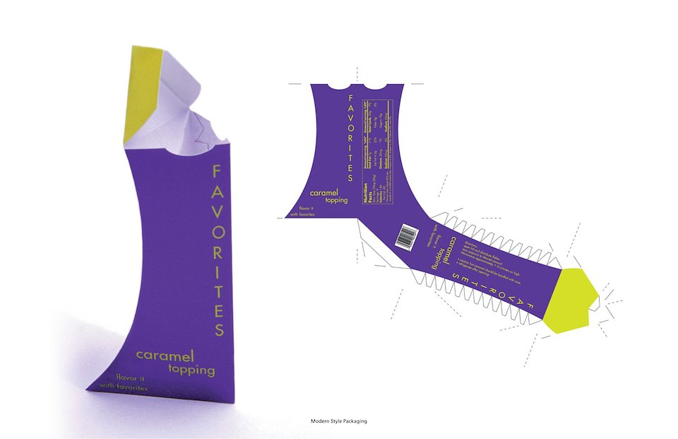
Modern Style Packaging (1 of 4 versions for Favorites Caramel Topping)
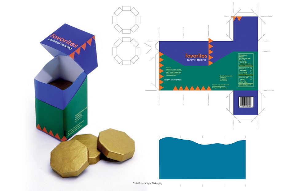
Post-Modern Style Packaging (1 of 4 versions for Favorites Caramel Topping)
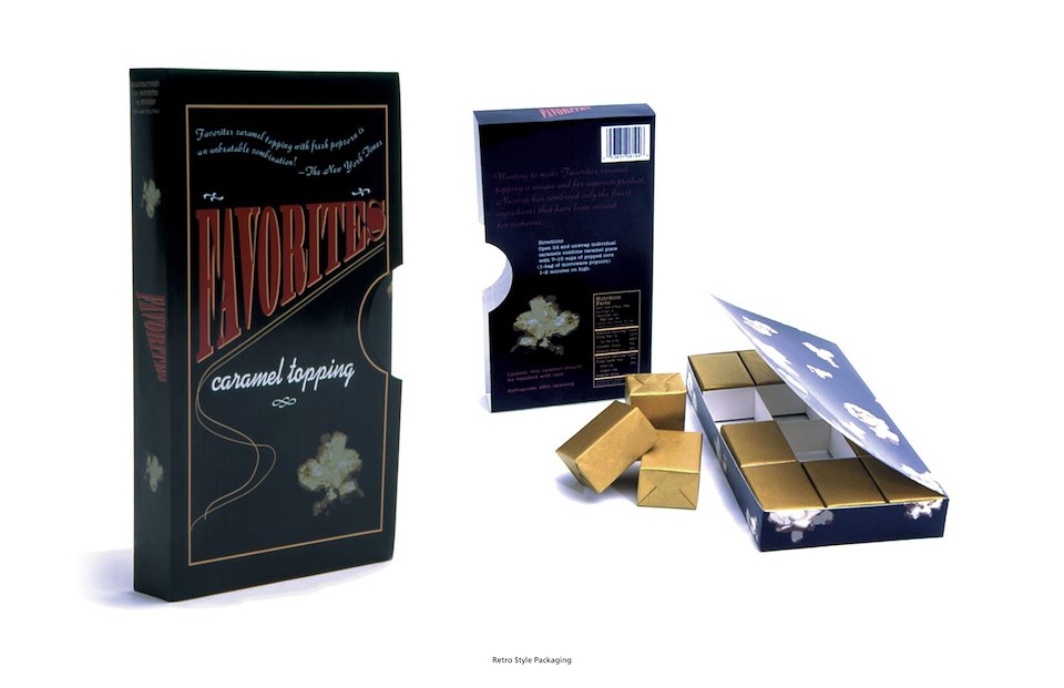
Retro Style Packaging (1 of 4 versions for Favorites Caramel Topping)
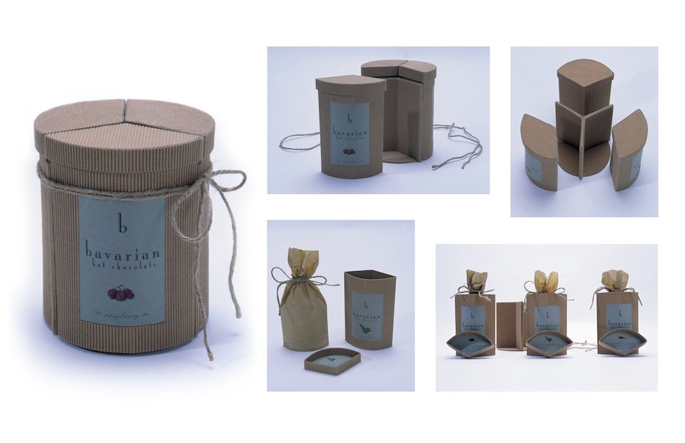
This is a package design I created, (from concept, materials used, labeling, and packaging) utilizing the inclusion of 3 different flavors of hot chocolate mix combined as one unit, but inheriting the ability to separate them when fully opened.